
Before addressing this project, I must mention that it was carried out while I was working at RunaId, a company with which I signed a non-disclosure agreement (NDA).
After speaking with them, I obtained authorization to display only a few screens from the website, which were used for A/B testing with users at that time. I also received permission to showcase some screens from the application design.
Throughout the design process, there were several iterations, and the final result was completely different, both for the website and the application.
Context
The Provincial Directorate of Public Revenues of San Luis chose to make changes to its website with the aim of optimizing the user experience. The majority of its users are professionals in accounting and business administration. Additionally, it has general users who independently manage their processes on the platform.
The original portal was developed in the early 2000s and was never modernized. Instead, components were added in different areas, resulting in a cluttered webpage.

The purpose of the new platform was to enhance the experience of each user within the platform, making it easier for them to declare taxes and income, make payments for stamps, and check the status of their assets or vehicles without any hassles. Transparency and clarity proved to be key elements in the redesign.
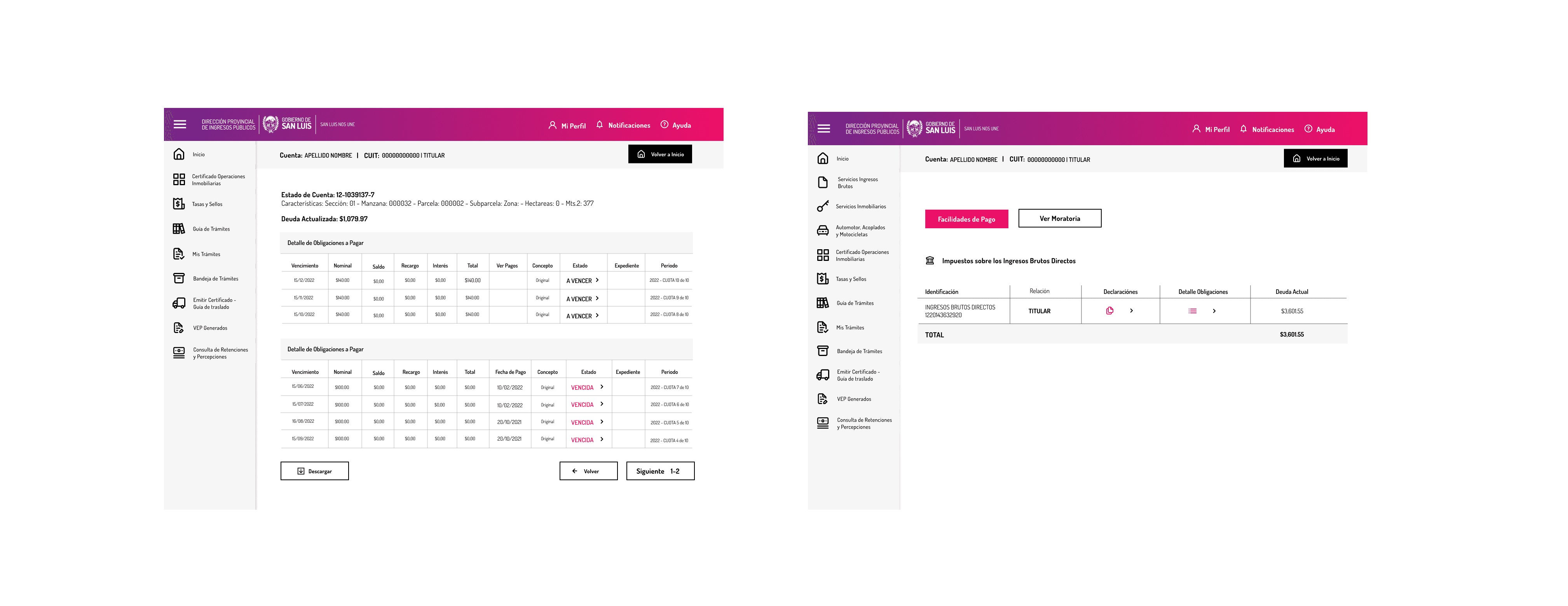
A/B testing
Prior to the start of the design, I obtained a template that had already been evaluated and iterated upon. Based on that, I chose to create two versions of the homepage to test them with users.

Result
A total of 20 people were interviewed, half of whom were regular users, and the rest were accounting professionals.
Regular users chose design number 2 because they felt that it was more visually intuitive and made it easier for them to find what they needed. They also considered it important to have shortcuts on the desktop for common tasks like:
· Ingresos Brutos (Income Taxes)
· Inmuebles (Real Estate)
· Automotores (Automobiles)
The professionals were divided in their decision:
Many of them chose design number 2 for its visual convenience, while the more experienced professionals preferred design number 1 because they found it "more similar" to what they were already familiar with.
With these results, priority was given to regular users, and the development of design number 2 was continued.
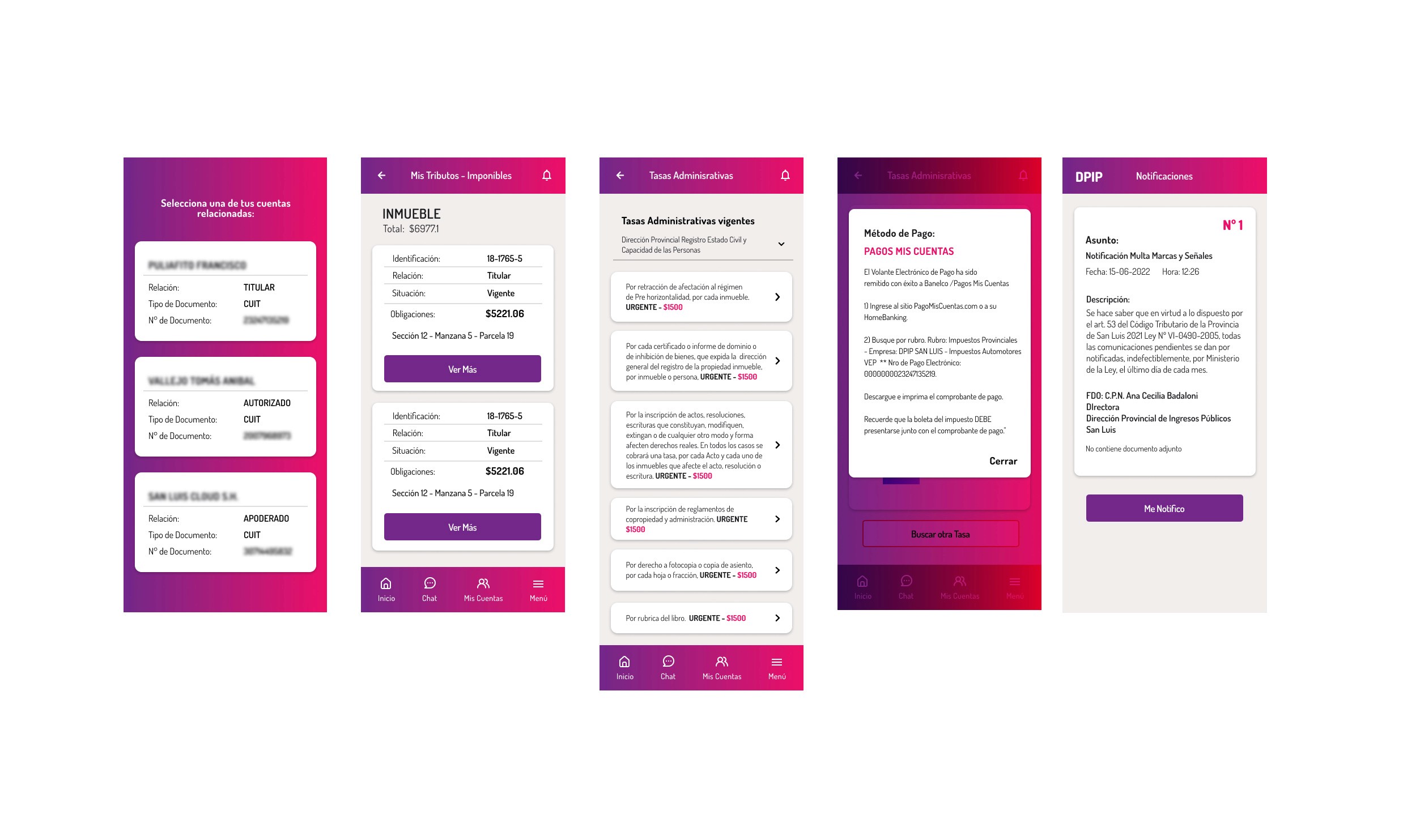
Context
With the web app progressing, we initiated the development of the application. The goal was to reach those individuals who lacked internet access or a computer at home. The instructions were identical to what we received initially for the redesign of the web app: Ensure that users could enjoy a smooth experience when managing their tax obligations.
The app was designed for use on both Android and iOS platforms.
Below, I'll show you some of the screens with the proposed design. Please note that this was not the final design, but screens on which we iterated many times, resulting in a different outcome.
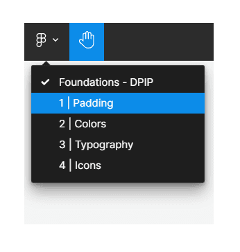
Design System
For the mobile application project, I created the design system, in this case I can only show a part of the documentation, such as: padding, colors, typography and icons.
To view all sections in Figma, please click on the Figma logo as shown in the image. Thank you.
See Design System